Project description:
Kopfmedia designed a complete corporate design (CD) for Jürgen Rapp e.K.: starting with the logo, through print media such as business cards, to digital media such as photographs.
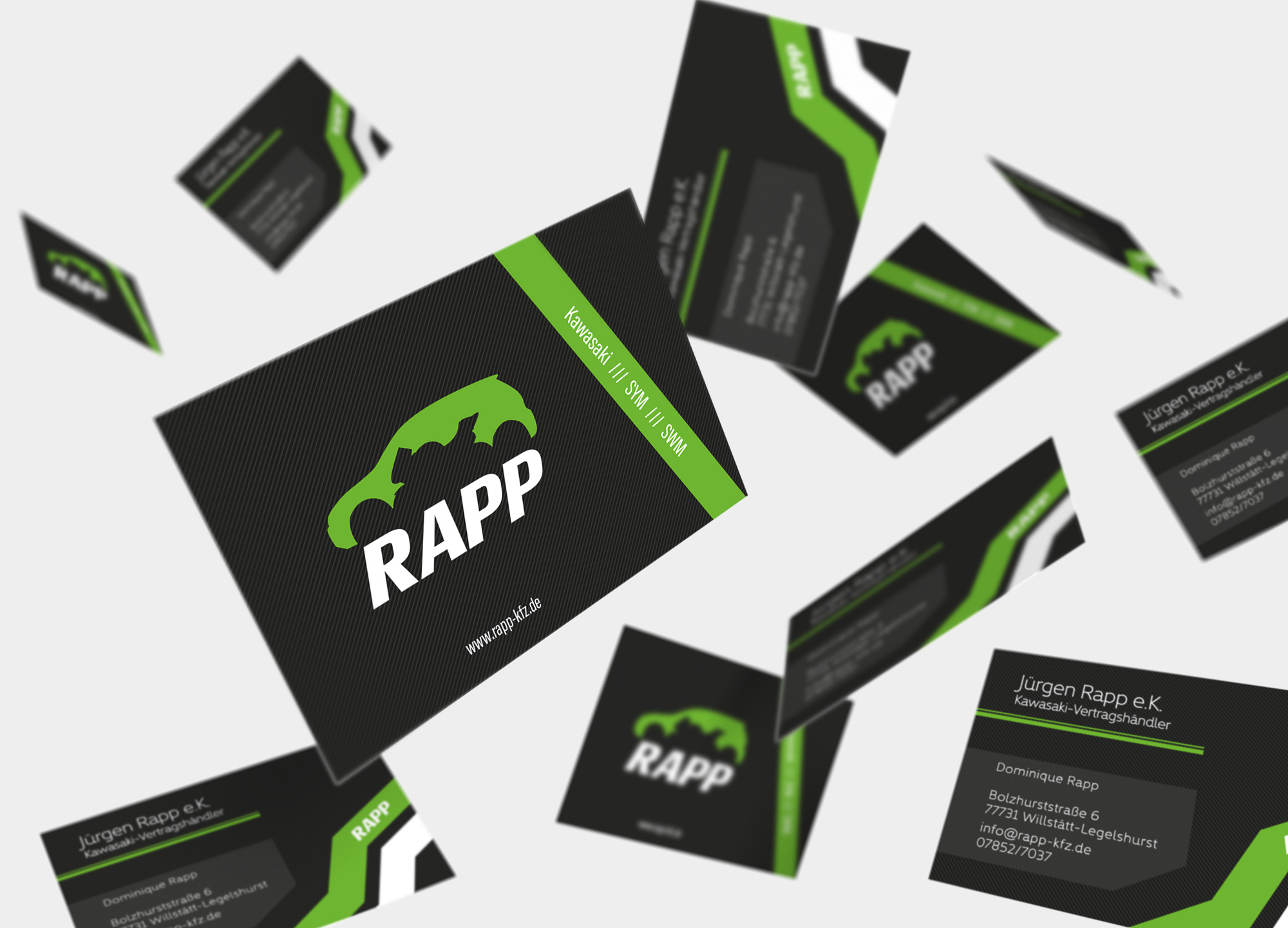
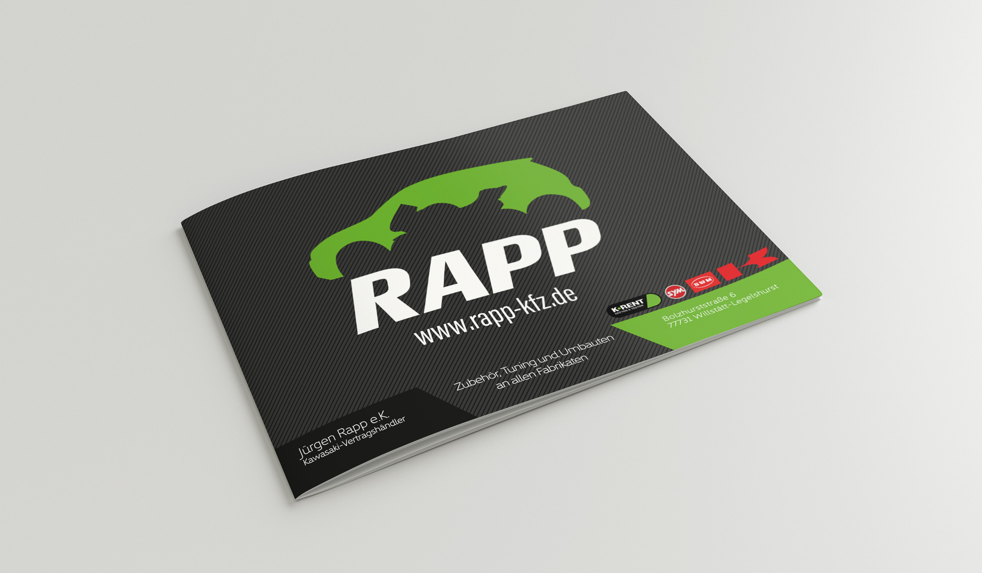
The Kawasaki dealer uses the colors black and green. For a uniform presentation we decided to stick with these colors for the CD of Jürgen Rapp e.K.. It was important to the client that the two main areas – cars and motorcycles – are recognizable in the logo. When designing the logo we made sure that it fulfilled all the necessary characteristics for a logo: It is very memorable, has simple contours and can be easily displayed in black and white.
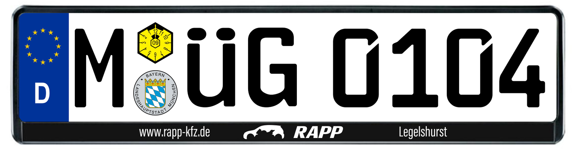
The logo can also be found on the license plate booster. It is like usual kept very simple: On the left is the web address and on the right is the dealer’s location.
The business cards fit in very well with the CD thanks to their sporty design. The clear contours and dynamic stripes make the business cards look modern and young.
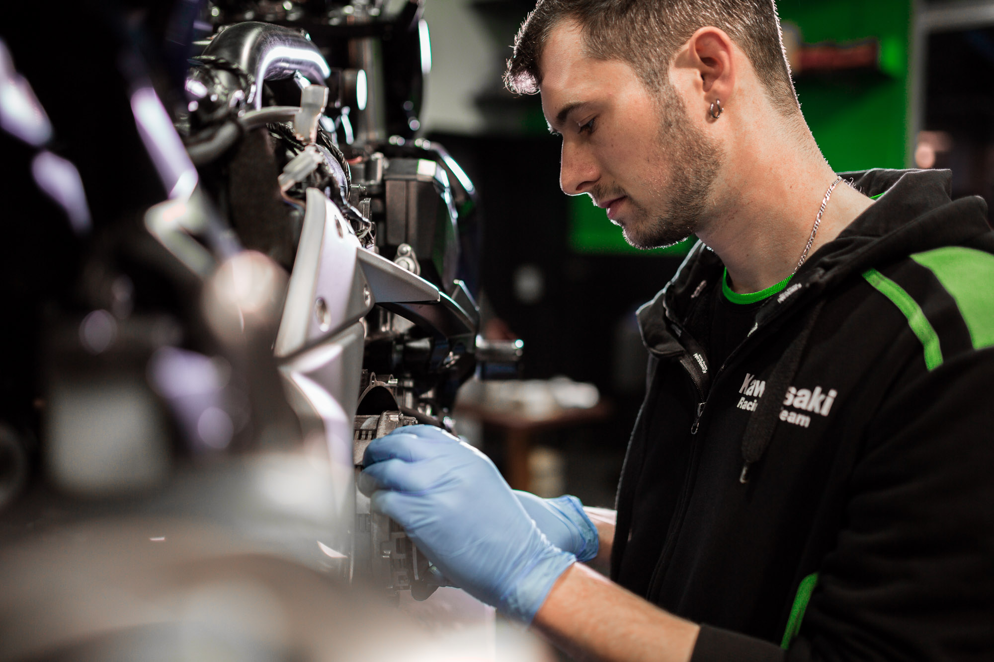
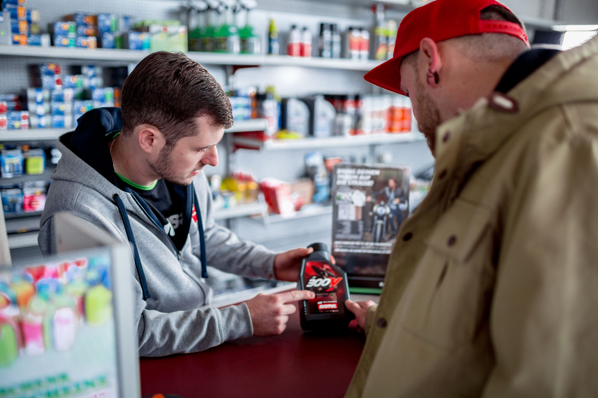
Expressive image photos play a major role in a successful external appearance of a company. They provide an insight into the company, reach prospective customers on a more personal level and thus shorten the distance between customer and company. Photos like these can be used in a variety of ways: For social media, for websites or online stores, or for print media of all kinds.
The design of the brochure is strongly based on that of the business cards. We also used the cover image of the brochure in a slightly modified version as a company sign and as an advertising banner.
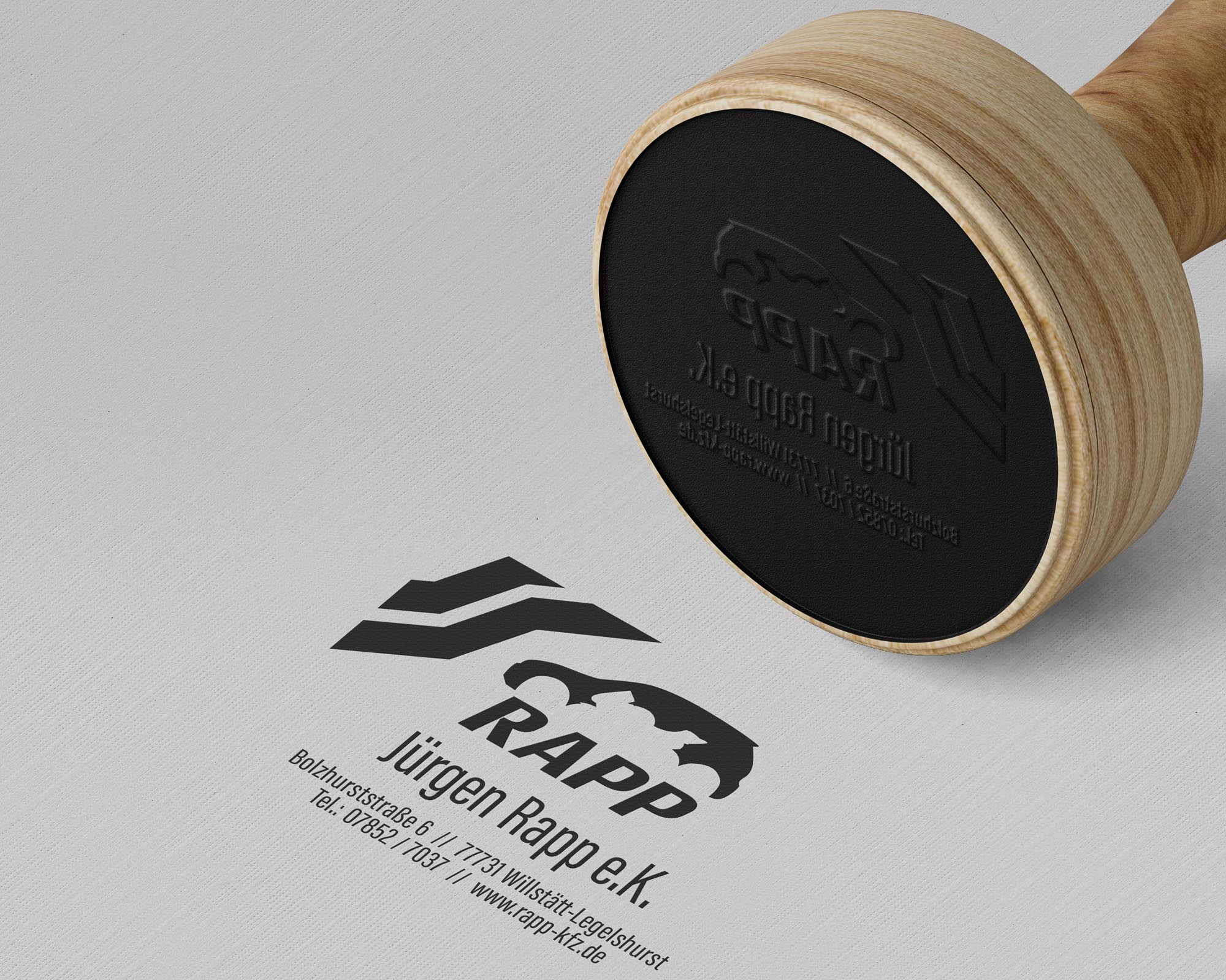
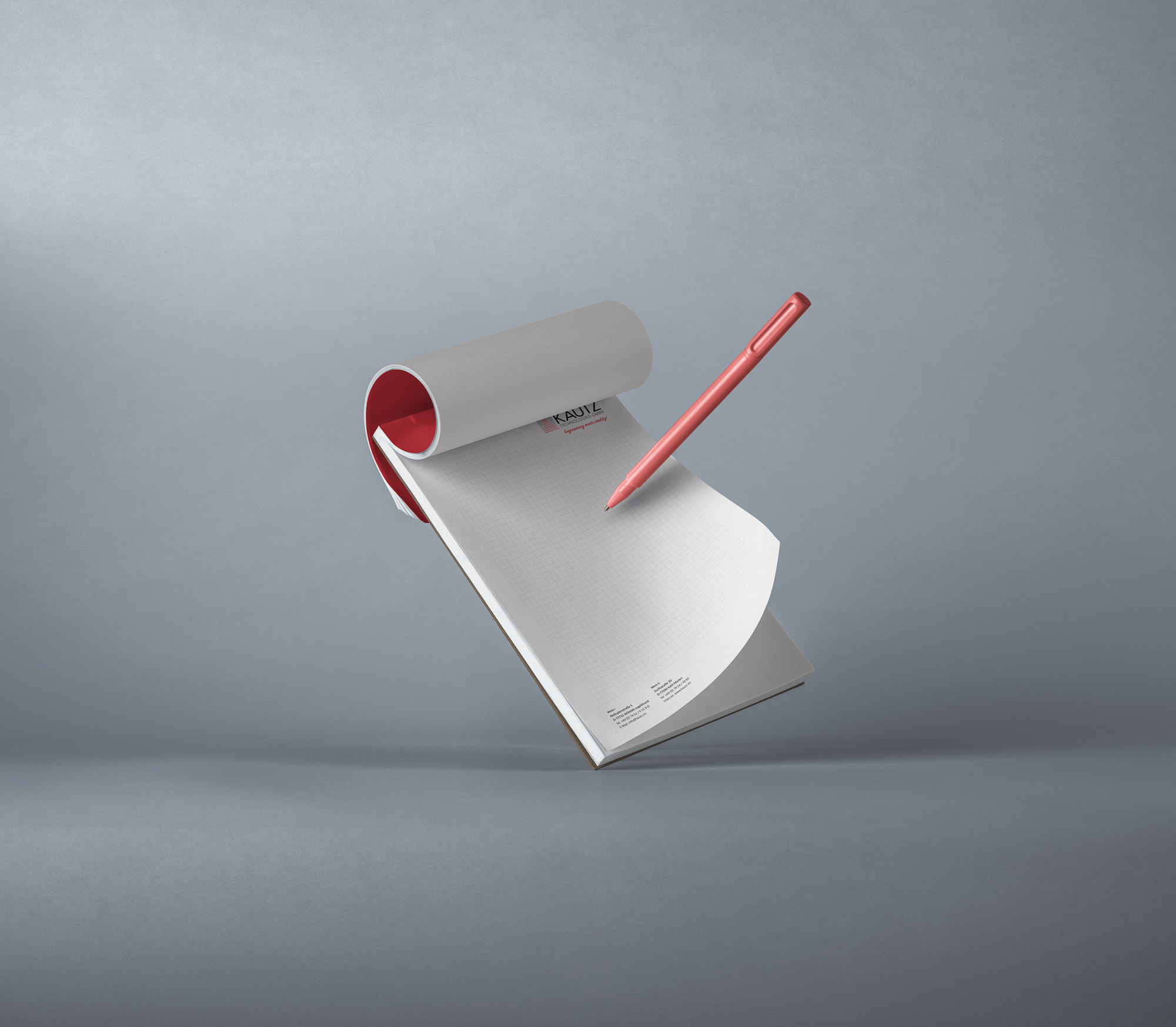
Office supplies such as stamps and stationery are an essential part of a complete CD, because they are also part of a company’s corporate identity. The stamp picks up on the sporty stripes of the business cards and the logo and all important contact details are included in the design.